With a myriad of bar, dining, shopping and entertainment options springing up daily, the ultimate entertainment destination needs to constantly remind customers that it can compete with the best out there – all under one roof.
BRAND:
No matter when you visit, you can count on your time at Crown being anything but ordinary…
This campaign appeared in the Melbourne and Perth markets.
LUNAR NEW YEAR:
Crown are noted for celebrating Lunar New Year in style at their complexes.
This is how we welcomed the Year of the Dog in Melbourne. Woof!
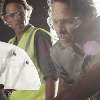
VALUE GUARANTEE:
The Value Guarantee campaign proved so successful for Crown Perth last year, they rekindled the magic this Winter.
END OF YEAR:
Rather than doing a Xmas campaign, we created this outdoor campaign highlighting Crown Perth’s talented staff that could be used as early as October right up till New Years Day.
STADIUM:
Usually Crown Perth’s location was seen as a hurdle but then Optus built a footy stadium right next door. This outdoor campaign encouraged sports fans to start the ‘game’ early or keep the ‘game’ alive after the match.
Relegated to the bargain bins and labeled as the go to “Dad Jean” Levi’s men’s range couldn’t hold a stitch to its once iconic and revered reputation that it had worked so hard to build through the ages. So they decided to discontinue some of their straight cuts and introduce a few new stylish, more-tapered options.
They wanted a POS campaign that could be easily installed and removed from their various stores without too much complication.
We offered them three core ideas to leverage their line “Live in Levi’s” off. Designed as a broadsheet, magazine that are found in many trendy fashion outlets – we came up with a look, feel and concept that would fit them perfectly.
Moët Hennessy Collection
A first for MH. A first for me too. Creating, designing and developing an e-commerce site from scratch for one of the world’s foremost luxury brands. Here consumers could buy some of the planet’s most premium champagnes, spirits and wines directly from the source.
After a gazillion conference calls and meetings it launched in 2014. Cheers!
When a close friend of mine made the bold move to re-invent his Mezze restaurant as a 1920s inspired cocktail bar, I was, for the most parts, somewhat intrigued. But when he hired me to bring this vision to life, intrigue had to turn into inspiration.
Working closely with the architects, I set about creating a Brand Strategy and Brand Identity that befitted the great expectations held for this venue.
Making the bar not just another dimly-lit speak-easy, taking advantage of Sydney’s recently relaxed lock-out laws and recognising the dawning of a new decade made the perfect mix for our own distinctive brand of cocktail – The Cat’s Meow.
Digitally led – personalised emails, EDMs, social media and an interactive website made for a very successful launch and the building of a passionate and ever-growing fanbase. In a short space of time The Cat’s Meow has become more than a bar, it is a destination.
From the name to the logo and all the comms, this has been a dream project for me. Having total autonomy, from photography to content and being deemed ‘Creative Director for Life’ by the owners, made for levels of greatness that even Jay Gatsby might have found intimidating.
Femcare and adult-care comms done with frankness, honesty and dignity can still be effective and light-hearted.
UbK
Made for a younger generation used to having their own way it made sense to let them call the shots. No one knows these young ladies better than themselves so Kimberly Clark make products to meet their demands and the creative is based on insights and stats provided by them.
Depend
The most successful adult-care ad to date.
Poise
Nothing’s a big deal if you handle it with poise.
The world’s favorite season meets the world’s favorite drink – a match made in ad heaven.
One is a recreation of the epic Summer ads of the past with a modern twist. This worked so well for Coca-Cola, they ran it again the following year and linked an on-line rewards program to it too.
The other a sentimental favorite of mine and quite possibly a certain supermodel’s first taste of fame…
Sports sponsorship is a massive part of the Qantas marketing machine.
The Ashes
With Australia still smarting from the first Ashes test earlier that same year Qantas threw it’s support behind the team for the return test on home soil.
Lions Tour
With the British and Irish Lions Tour back in Australia after 12 years, we created a campaign to encourage visiting Lions supporters from Britain and Ireland to fly Qantas from Europe instead of their own national carriers. Qantas offered such an irresistible rugby and holiday package for overseas visitors, they couldn’t help give it a try. An interactive website detailing the promo and experiences was key to the campaign.
To justify being slightly more expensive than similar dessert offerings out there, we suggested that consumers will compromise on everything else except the deliciousness of their favourite dessert.
So when it came to making a campaign for Sara Lee, it seemed natural for us to compromise on that staple of advertising commercials – the celebrity endorsement – choosing instead lookalikes so that we could afford to get the message of Sara Lee’s true irresistibility out there.
TV, content videos, print, social media one on ones with our lookalikes were part of the campaign.
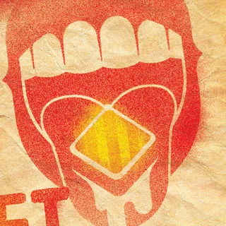
Brand
When asked, most people found it really difficult to put into words what drinking a Coke or Coke Zero felt like. But they found it easier to express themselves with weird sounds, gasps, sighs and outrageous body movements. It was the closest they could get to the taste. Seemed bonkers enough to put into an ad – so we did. Mmmm mama hoot hoot!
The rest of the campaign then concentrated on bringing further taste descriptions alive in a visually striking series of posters and billboards.
Picture Magazine
As part of their sponsorship of the footy, Coke Zero commissioned a series of ads to go in Picture Men’s Magazine – a publication you don’t buy for the articles…
We partnered with the Real Pet Food Company to build an innovative brand to lead the humanization of pet food from the farm-ground up. We created the website and started conversations in social, supported trade and shopper, made a splash in PR, talked to our consumers and their owners and built a path to purchase approach. We then went ATL with further support in trade with a film to communicate our idea – from farm to Farmers Market to bowl and path to purchase support in grocery which we then supported with brand activations (which featured the coolest star and POS ever - a 1942 Fargo Ute that we bought and refurbished) before extending the idea into new channels like Doggie Dining.
A remarkably innovative urban regeneration project that needed its true scope and vision brought to life before it was anywhere near finished.
The Lend Lease Book
A beautifully designed mission statement that brought to life Lend Lease’s philosophy and that of it’s visionary founder Dick Dusseldorp.
The following is a selection of my work as Designer and Design Director.
Coca-Cola Christmas
A series of Coca-Cola brand metrolites added a bit of Christmas colour and cheer to the streets of the nation. I was fortunate enough to collaborate with the likes of Jonathan Zawada and Luca Ionescu on some of these.
Cape Mentelle
To highlight the environmentally responsible manufacturing processes of Moet & Hennessey’s Cape Mentelle wines we decided to bring a piece of Margaret River into the hip inner-city suburbs of Australia via the Urban Garden. Yours to nurture and cultivate when you purchased a case of Cape Mentelle, naturally.
Coca-Cola with Lime
A new twist to the Coke taste needed some classic poster art. These metrolites proved so desirable to collectors that snatching the posters from out of their glass housings was the only sour taste in an otherwise sweet campaign.
Telstra - Road to Tamworth
To drum up support for their Country NSW network, Telstra threw their hat into the ever popular, Country Music talent search ,ring. These gig poster-inspired designs appeared in country town pubs and other live music venues throughout New South Wales.
Coca-Cola Footy
Two of a series of designs Coke commissioned every year to kick-off the start of finals series for the various football codes they sponsored.
South African Airways
I designed the custom livery for the Boeing 747-300 that transported South Africa’s athletes to the Olympic Games in Atlanta. It became a memorable statement from a country just waking up to a new era of liberation and was quickly adopted as a symbol of the rainbow nation. The plane and design still live on in the highly desired and collectable scale models still available for sale.
Ogilvy
A visual brand refresh for Ogilvy when they changed premises. New logo interpretation, business cards and vinyl murals were a quick, effective and economical way to brand the new building with the Ogilvy culture.
Working closely with Ogilvy Digital’s coders, UI and UX crew, my designs were adapted for the company website too.
As part of Ogilvy’s “DO” initiative I created a series of icons that were used in presentations, internal staff programs, clients pitches and signage.
Logos
A small selection of the many logos I’ve designed.
Australia’s largest insurance broker network needed to highlight the value of using an insurance broker – particularly a Steadfast one. Tapping into that most primal of emotions to afflict thousands of small to medium businesses – fear – seemed like an effective place to start.
A previous campaign saw us create intimate case studies of Steadfast brokers and their clients which lived online on the Steadfast website. A big feature of a Steadfast broker is their intimate knowledge and local insight into their clients businesses.
Chandon
From the prestigious Moët and Hennessy stable this local sparkling wine range is for occasions that are a bit more out of the ordinary than most. We created imagery for them that capture that moment of social frisson one feels as you arrive at a venue filled with your closest friends.
These were used for everything from metrolites to window displays and on-premise activations. Backed up with an equally appealing website, App and annual Summer promotions it didn’t take long for them to get to the top of the sparkling wine category in Australia.
Out of the numerous NSW Government projects I’ve worked on it’s safe to say this one is my favourite. A three year campaign that we had to conceive and produce, all at the same time, a year ago – it’s been working very effectively with TV, outdoor, website, and an App all being part of the mix.
Outdoor Billboards
A brand with a heritage of calling it like it is wanted to re-engage a increasingly cynical youth market. So we decided to try honesty and made a thing out of the under-promise so evident in most advertising AND naming and shaming a few embarrassing social truths we seem to be in denial about. It proved to be the best policy. Located in many inner-city and metro train stations these posters cut through the clutter.
Online
We continued this theme online and on social media with a series of webisodes hosted by the “Truth Hunters”.
Brand TVC
One of a very few brands ads created out of Australia. Proved extremely popular locally and globally as well with it being run in countries as far afield as Poland and Turkey.
Custom built by the WPP Group (STW Group), Shift was positioned as a “change” agency and was not supposed to look like a typical ad agency. So ditching the slick, designed-to-death branding of most ad agencies we embraced an anti-design philosophy and treated Shift as if it were the love-child of a freight company and a skate-shop.
Using tinted and wall-sized vinyl decals and the occasional coat of paint we changed a small, unassuming space in Redfern into the headquarters of the “agents for change”.
This visual assault carried on to the corporate I.D., staff comms and website.
Australia’s most trusted pain reliever has consolidated this position over the past seven years with the “It’s My Choice” campaign. This allowed us to hero everyday Australians from all walks of life and see the various ways they deal with pain relief. This campaign has stood strong through much competitive advertising from the likes of Herron and Neurofen.
It was voted one of the most successful campaigns within the GSK portfolio and has been replicated in many other countries globally.
Panadol Earth Hour
Going dark for the planet is one thing. Painfully hurting yourself whilst stumbling around in the dark is quite the other. Panadol offered consumers a series of glow-in-the-dark decals to label potential causes of pain when the lights go out.
Now that’s smart pain relief!
Milo
Although having a well-loved heritage, Milo was turning sour with modern Mums who saw it as a decadent, chocolate milkshake treat rather than a ”nutritious, energy food drink” for their kids. These campaigns set about highlighting Milo’s Low GI creds – way before everybody else jumped on the bandwagon. By combining the educational tone of the benefits of Milo with a cool contemporary visual presentation style – we won over both Mums and kids of all ages. The “75 years young” ad being one of the most loved and recalled ads in Milo’s recent history.
Uncle Tobys
One of a series in the popular campaign using famous Aussie athletes. This one leveraging the hype, hysteria and fascination the country has with swimming and Olympic records.
Smoothers
One of Nestlé’s smaller brands operating in the “it’s neither a lolly nor a medicated lozenge” category. This allowed us to make them quirky and slightly off-beat.
In a car rental market increasingly cluttered with new product innovations, systems and technologies, people value that which makes their lives simpler and not more complicated. An insight we used when tasked to refresh the Budget brand.
From the clean, minimalistic art direction/design, the staccato economy-of-word headlines and Budget’s streamlined tech everything about this campaign says Budget is committed to making sure car rental is as simple as can be and not a journey in and of itself.
A good example to drive home the point that retail comms needn’t be ugly and in your face.
The politics behind it’s cost, construction and ownership clouded the fact it was a pretty viable option to escape the rush hour gridlock. That didn’t stop us creating a targeted regional-press led campaign with outdoor support, extolling it’s virtues.
This was supported by an app that effortlessly showed you how to cut to the chase and find your nearest route out of rush-hour traffic and into the Cross City Tunnel. Usage numbers had never been higher during this campaign.
The drink of choice for many Hollywood big-wig movers and shakers, Diet Coke was firmly positioned as “something for the ladies” here in Australia.
The “Brightness” campaign taps into the unmistakable lift a bubbly drink can deliver.
My Life. My Card.
The only Australian contribution to the massive, global American Express “My Life. My Card” above-the-line brand campaign.
More Than Just a Card.
This multiple card, cross-platform campaign was home-grown but rolled out across the planet.
A rarity at the time. A Guinness brand ad created outside of Europe. Guinness ads set a pretty high bar – this one held its own.
Tired of being the brand that grannies kept tucked away in their handbags. Soothers put the challenge out there to make the brand trendier and appeal to an entire new demographic.
Starting life as an outdoor fly-poster campaign positioning Soothers as a miraculous cure all it evolved to a more traditional gig poster format when we joined up with Nova FM and launched a series of pop-up gigs in weird and wonderful locations featuring some of Australia’s best musical talent.
Predictably, online and social media buzz ensued.
An independent bug-spray manufacturer needed a profile-lift to help get them on the shelves of a big retail chain. Perfect challenger-brand territory. What better spokesperson for killing annoying pests than death himself. Viral videos, website, a sales promo and packaging were all part of our arsenal of death.
Ready to take flight… an administrative issue at Hovex pulled the wings off this baby.
Outdoor Billboards
The world’s favorite fizzy stuff in gulp-size cans. We kept it simple but clever.
Ambient
Seemed only natural to take one of street-media’s most popular canvasses (the humble bus shelter) and shrink-ray it. Got a lot of attention! Though there were a few disappointed pigeons waiting for a bus that never came!
Oasis Couch Project
Couch homelessness is not visible to the general public. It affects mostly the youth and happens on couches and sofas in some of Australia’s most unhealthy environments: drug dens, squats, abusive homes, etc. We helped The Salvation Army and Oasis its youth support network bring this serious problem to light with the launch of the Couch Project.
With a cinema ad, at-home and in-school awareness programs and a weekend-long live-in cube at Sydney’s Circular Quay, awareness and donations soared to an all time high.
Zero point five percent
An initiative taken up by the zero point five percent movement with support from the Bill and Melinda Gates Foundation, this was our chance to convince our government and the public naysayers that this very tiny contribution could have a massive effect on the world’s poor and needy.
All Together Now
Committed to erasing racism in all forms, All Together Now, a non-profit organisation joined forces with The Body Shop to give it the finger!
The Body Shop customers in Australia were asked to Give Racism The Finger by dipping their finger in ink and making their mark on a canvas in the store. By doing so, they made a commitment to speak up when they witness racism.
R U OK?
Sharing office space with the R U OK? gang and being a former work mate of it’s founder Gavin Larkin meant I couldn’t not help out every now and then. From orchestrating a stunt on Bondi Beach to mark R U OK? Day to taking the show on the road to country Australia in the R U OK MATE? bus it was a pleasure to contribute to this great cause.